Hierarchy
This layout manages multiple child Components, each fitted to the Container, where only a single child Component can be visible at any given time. This layout style is most commonly used for wizards, tab implementations, etc. This class is intended to be extended or created via the layout:'card' Ext.container.Container.layout config, and should generally not need to be created directly via the new keyword.
The CardLayout's focal method is setActiveItem. Since only one panel is displayed at a time, the only way to move from one Component to the next is by calling setActiveItem, passing the id or index of the next panel to display. The layout itself does not provide a user interface for handling this navigation, so that functionality must be provided by the developer.
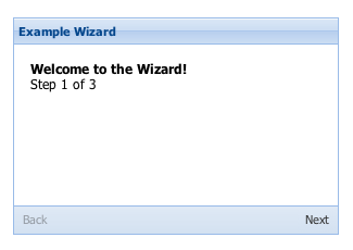
In the following example, a simplistic wizard setup is demonstrated. A button bar is added
to the footer of the containing panel to provide navigation buttons. The buttons will be handled by a
common navigation routine -- for this example, the implementation of that routine has been ommitted since
it can be any type of custom logic. Note that other uses of a CardLayout (like a tab control) would require a
completely different implementation. For serious implementations, a better approach would be to extend
CardLayout to provide the custom functionality needed.
 Example usage:
    var navHandler = function(direction){
         // This routine could contain business logic required to manage the navigation steps.
         // It would call setActiveItem as needed, manage navigation button state, handle any
         // branching logic that might be required, handle alternate actions like cancellation
         // or finalization, etc.  A complete wizard implementation could get pretty
         // sophisticated depending on the complexity required, and should probably be
         // done as a subclass of CardLayout in a real-world implementation.
     };

    Ext.create('Ext.panel.Panel', {
        title: 'Example Wizard',
        width: 300,
        height: 200,
        layout: 'card',
        activeItem: 0, // make sure the active item is set on the container config!
        bodyStyle: 'padding:15px',
        defaults: {
            // applied to each contained panel
            border:false
        },
        // just an example of one possible navigation scheme, using buttons
        bbar: [
        {
            id: 'move-prev',
            text: 'Back',
            handler: navHandler(this, [-1]),
            disabled: true
        },
        '->', // greedy spacer so that the buttons are aligned to each side
        {
            id: 'move-next',
            text: 'Next',
            handler: navHandler(this, [1])
        }],
        // the panels (or "cards") within the layout
        items: [{
            id: 'card-0',
            html: '<h1>Welcome to the Wizard!</h1><p>Step 1 of 3</p>'
        },{
            id: 'card-1',
            html: '<p>Step 2 of 3</p>'
        },{
            id: 'card-2',
            html: '<h1>Congratulations!</h1><p>Step 3 of 3 - Complete</p>'
        }],
        renderTo: Ext.getBody()
    });
Config Options
CSS Class configs
An optional extra CSS class that will be added to the container. This can be useful for adding customized styles to the container or any of its children using standard CSS rules. See Ext.Component.ctCls also.
Other Configs
Flag to notify the ownerCt Component on afterLayout of a change
Flag to notify the ownerCt Component on afterLayout of a change
Flag to notify the ownerCt Container on afterLayout of a change
Flag to notify the ownerCt Container on afterLayout of a change
True to render each contained item at the time it becomes active, false to render all contained items as soon as the layout is rendered (defaults to false). If there is a significant amount of content or a lot of heavy controls being rendered into panels that are not displayed by default, setting this to true might improve performance.
An optional extra CSS class that will be added to the container. This can be useful for adding customized styles to the container or any of its children using standard CSS rules. See Ext.Component.ctCls also.
Methods
Return the active (visible) component in the layout.
Return the active (visible) component in the layout.
Returns
- Ext.Component
Returns an array of child components either for a render phase (Performed in the beforeLayout method of the layout's base class), or the layout phase (onLayout).
Returns
- Array
of child components
Return the active (visible) component in the layout to the next card
Return the active (visible) component in the layout to the next card
Parameters
- wrap : Object
Returns
- Ext.Component
Return the active (visible) component in the layout to the previous card
Return the active (visible) component in the layout to the previous card
Parameters
- wrap : Object
Returns
- Ext.Component
Returns the element into which rendering must take place. Defaults to the owner Container's Ext.AbstractComponent.targetEl.
May be overridden in layout managers which implement an inner element.
Returns
- Ext.core.Element
Returns the owner component's resize element.
Returns the owner component's resize element.
Returns
- Ext.core.Element
Sets the active (visible) component in the layout to the next card
Sets the active (visible) component in the layout to the next card
Parameters
- anim : Object
- wrap : Object
Returns
- void