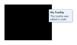
Provides attractive and customizable tooltips for any element. The QuickTips singleton is used to configure and manage tooltips globally for multiple elements in a generic manner. To create individual tooltips with maximum customizability, you should consider either Ext.tip.Tip or Ext.tip.ToolTip.
Quicktips can be configured via tag attributes directly in markup, or by registering quick tips programmatically via the register method.
The singleton's instance of Ext.tip.QuickTip is available via getQuickTip, and supports all the methods, and all the all the configuration properties of Ext.tip.QuickTip. These settings will apply to all tooltips shown by the singleton.
Below is the summary of the configuration properties which can be used. For detailed descriptions see the config options for the QuickTip class
QuickTips singleton configs (all are optional)
dismissDelayhideDelaymaxWidthminWidthshowDelaytrackMouse
Target element configs (optional unless otherwise noted)
autoHideclsdismissDelay(overrides singleton value)target(required)text(required)titlewidth
Here is an example showing how some of these config options could be used:

Code
// Init the singleton.  Any tag-based quick tips will start working.
Ext.tip.QuickTipManager.init();

// Apply a set of config properties to the singleton
Ext.apply(Ext.tip.QuickTipManager.getQuickTip(), {
    maxWidth: 200,
    minWidth: 100,
    showDelay: 50      // Show 50ms after entering target
});

// Create a small panel to add a quick tip to
Ext.create('Ext.container.Container', {
    id: 'quickTipContainer',
    width: 200,
    height: 150,
    style: {
        backgroundColor:'#000000'
    },
    renderTo: Ext.getBody()
});


// Manually register a quick tip for a specific element
Ext.tip.QuickTipManager.register({
    target: 'quickTipContainer',
    title: 'My Tooltip',
    text: 'This tooltip was added in code',
    width: 100,
    dismissDelay: 10000 // Hide after 10 seconds hover
});
To register a quick tip in markup, you simply add one or more of the valid QuickTip attributes prefixed with the ext namespace. The HTML element itself is automatically set as the quick tip target. Here is the summary of supported attributes (optional unless otherwise noted):
hide: Specifying "user" is equivalent to setting autoHide = false. Any other value will be the same as autoHide = true.qclass: A CSS class to be applied to the quick tip (equivalent to the 'cls' target element config).qtip (required): The quick tip text (equivalent to the 'text' target element config).qtitle: The quick tip title (equivalent to the 'title' target element config).qwidth: The quick tip width (equivalent to the 'width' target element config).
Here is an example of configuring an HTML element to display a tooltip from markup:
// Add a quick tip to an HTML button
<input type="button" value="OK" ext:qtitle="OK Button" ext:qwidth="100"
     data-qtip="This is a quick tip from markup!"></input>
Methods
Initialize the global QuickTips instance and prepare any quick tips.
Initialize the global QuickTips instance and prepare any quick tips.
Parameters
- autoRender : Boolean
True to render the QuickTips container immediately to preload images. (Defaults to true)
Returns
- void
Returns true if quick tips are enabled, else false.
Returns true if quick tips are enabled, else false.
Returns
- Boolean
Configures a new quick tip instance and assigns it to a target element. See Ext.tip.QuickTip.register for details.
Configures a new quick tip instance and assigns it to a target element. See Ext.tip.QuickTip.register for details.
Parameters
- config : Object
The config object
Returns
- void