Hierarchy
This layout allows you to easily render content into an HTML table. The total number of columns can be
specified, and rowspan and colspan can be used to create complex layouts within the table.
This class is intended to be extended or created via the layout: {type: 'table'}
Ext.container.Container.layout config, and should generally not need to be created directly via the new keyword.
Note that when creating a layout via config, the layout-specific config properties must be passed in via the Ext.container.Container.layout object which will then be applied internally to the layout. In the case of TableLayout, the only valid layout config properties are columns and tableAttrs. However, the items added to a TableLayout can supply the following table-specific config properties:
- rowspan Applied to the table cell containing the item.
- colspan Applied to the table cell containing the item.
- cellId An id applied to the table cell containing the item.
- cellCls A CSS class name added to the table cell containing the item.
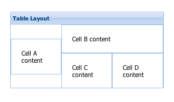
The basic concept of building up a TableLayout is conceptually very similar to building up a standard HTML table. You simply add each panel (or "cell") that you want to include along with any span attributes specified as the special config properties of rowspan and colspan which work exactly like their HTML counterparts. Rather than explicitly creating and nesting rows and columns as you would in HTML, you simply specify the total column count in the layoutConfig and start adding panels in their natural order from left to right, top to bottom. The layout will automatically figure out, based on the column count, rowspans and colspans, how to position each panel within the table. Just like with HTML tables, your rowspans and colspans must add up correctly in your overall layout or you'll end up with missing and/or extra cells! Example usage:

// This code will generate a layout table that is 3 columns by 2 rows
// with some spanning included.  The basic layout will be:
// +--------+-----------------+
// |   A    |   B             |
// |        |--------+--------|
// |        |   C    |   D    |
// +--------+--------+--------+
    Ext.create('Ext.panel.Panel', {
        title: 'Table Layout',
        width: 300,
        height: 150,
        layout: {
            type: 'table',
            // The total column count must be specified here
            columns: 3
        },
        defaults: {
            // applied to each contained panel
            bodyStyle:'padding:20px'
        },
        items: [{
            html: 'Cell A content',
            rowspan: 2
        },{
            html: 'Cell B content',
            colspan: 2
        },{
            html: 'Cell C content',
            cellCls: 'highlight'
        },{
            html: 'Cell D content'
        }],
        renderTo: Ext.getBody()
    });
Config Options
CSS Class configs
An optional extra CSS class that will be added to the container. This can be useful for adding customized styles to the container or any of its children using standard CSS rules. See Ext.Component.ctCls also.
Other Configs
Flag to notify the ownerCt Component on afterLayout of a change
Flag to notify the ownerCt Component on afterLayout of a change
Flag to notify the ownerCt Container on afterLayout of a change
Flag to notify the ownerCt Container on afterLayout of a change
The total number of columns to create in the table for this layout. If not specified, all Components added to this layout will be rendered into a single row using one column per Component.
An optional extra CSS class that will be added to the container. This can be useful for adding customized styles to the container or any of its children using standard CSS rules. See Ext.Component.ctCls also.
An object containing properties which are added to the DomHelper specification used to create the layout's <table> element. Example:
{
    xtype: 'panel',
    layout: {
        type: 'table',
        columns: 3,
        tableAttrs: {
            style: {
                width: '100%'
            }
        }
    }
}Methods
Returns an array of child components either for a render phase (Performed in the beforeLayout method of the layout's base class), or the layout phase (onLayout).
Returns
- Array
of child components
Returns the element into which rendering must take place. Defaults to the owner Container's Ext.AbstractComponent.targetEl.
May be overridden in layout managers which implement an inner element.
Returns
- Ext.core.Element