Hierarchy
A layout that arranges items horizontally across a Container. This layout optionally divides available horizontal
space between child items containing a numeric flex configuration.
This layout may also be used to set the heights of child items by configuring it with the align option.
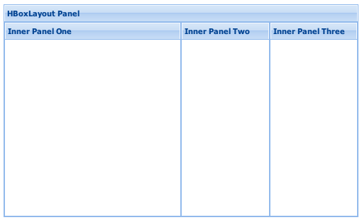
 Example usage:
Ext.create('Ext.Panel', {
    width: 500,
    height: 300,
    title: "HBoxLayout Panel",
    layout: {
        type: 'hbox',
        align: 'stretch'
    },
    renderTo: document.body,
    items: [{
        xtype: 'panel',
        title: 'Inner Panel One',
        flex: 2
    },{
        xtype: 'panel',
        title: 'Inner Panel Two',
        flex: 1
    },{
        xtype: 'panel',
        title: 'Inner Panel Three',
        flex: 1
    }]
});
Config Options
CSS Class configs
An optional extra CSS class that will be added to the container. This can be useful for adding customized styles to the container or any of its children using standard CSS rules. See Ext.Component.ctCls also.
Other Configs
Controls how the child items of the container are aligned. Acceptable configuration values for this property are:
- top : Defaultchild items are aligned vertically at the top of the container
- middle : child items are aligned vertically in the middle of the container
- stretch : child items are stretched vertically to fill the height of the container
- stretchmax : child items are stretched vertically to the height of the largest item.
If truthy, child Component are animated into position whenever the Container is layed out. If this option is numeric, it is used as the animation duration in milliseconds.
May be set as a property at any time.
Flag to notify the ownerCt Component on afterLayout of a change
Flag to notify the ownerCt Component on afterLayout of a change
Flag to notify the ownerCt Container on afterLayout of a change
Flag to notify the ownerCt Container on afterLayout of a change
If the individual contained items do not have a margins property specified or margin specified via CSS, the default margins from this property will be applied to each item.
This property may be specified as an object containing margins
to apply in the format:
{
    top: (top margin),
    right: (right margin),
    bottom: (bottom margin),
    left: (left margin)
}
This property may also be specified as a string containing space-separated, numeric margin values. The order of the sides associated with each value matches the way CSS processes margin values:
- If there is only one value, it applies to all sides.
- If there are two values, the top and bottom borders are set to the first value and the right and left are set to the second.
- If there are three values, the top is set to the first value, the left and right are set to the second, and the bottom is set to the third.
- If there are four values, they apply to the top, right, bottom, and left, respectively.
Defaults to:
{top:0, right:0, bottom:0, left:0}
This configuration option is to be applied to child items of the container managed by this layout. Each child item with a flex property will be flexed horizontally according to each item's relative flex value compared to the sum of all items with a flex value specified. Any child items that have either a flex = 0 or flex = undefined will not be 'flexed' (the initial size will not be changed).
An optional extra CSS class that will be added to the container. This can be useful for adding customized styles to the container or any of its children using standard CSS rules. See Ext.Component.ctCls also.
Controls how the child items of the container are packed together. Acceptable configuration values for this property are:
- start : Defaultchild items are packed together at left side of container
- center : child items are packed together at mid-width of container
- end : child items are packed together at right side of container
Sets the padding to be applied to all child items managed by this layout.
This property must be specified as a string containing space-separated, numeric padding values. The order of the sides associated with each value matches the way CSS processes padding values:
- If there is only one value, it applies to all sides.
- If there are two values, the top and bottom borders are set to the first value and the right and left are set to the second.
- If there are three values, the top is set to the first value, the left and right are set to the second, and the bottom is set to the third.
- If there are four values, they apply to the top, right, bottom, and left, respectively.
Defaults to: "0"
Methods
Returns an array of child components either for a render phase (Performed in the beforeLayout method of the layout's base class), or the layout phase (onLayout).
Returns
- Array
of child components
Returns the element into which rendering must take place. Defaults to the owner Container's Ext.AbstractComponent.targetEl.
May be overridden in layout managers which implement an inner element.
Returns
- Ext.core.Element
Returns the owner component's resize element.
Returns the owner component's resize element.
Returns
- Ext.core.Element