Hierarchy
Ext.layout.LayoutExt.layout.container.AbstractContainerExt.layout.container.ContainerExt.layout.container.Border
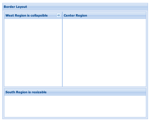
This is a multi-pane, application-oriented UI layout style that supports multiple nested panels, automatic bars between regions and built-in expanding and collapsing of regions.
This class is intended to be extended or created via the layout:'border'
Ext.container.Container.layout config, and should generally not need to be created directly
via the new keyword.
Example usage:
     Ext.create('Ext.panel.Panel', {
        width: 500,
        height: 400,
        title: 'Border Layout',
        layout: 'border',
        items: [{
            title: 'South Region is resizable',
            region: 'south',     // position for region
            xtype: 'panel',
            height: 100,
            split: true,         // enable resizing
            margins: '0 5 5 5'
        },{
            // xtype: 'panel' implied by default
            title: 'West Region is collapsible',
            region:'west',
            xtype: 'panel',
            margins: '5 0 0 5',
            width: 200,
            collapsible: true,   // make collapsible
            id: 'west-region-container',
            layout: 'fit'
        },{
            title: 'Center Region',
            region: 'center',     // center region is required, no width/height specified
            xtype: 'panel',
            layout: 'fit',
            margins: '5 5 0 0'
        }],
        renderTo: Ext.getBody()
    });
Notes:
- Any Container using the Border layout must have a child item with
region:'center'. The child item in the center region will always be resized to fill the remaining space not used by the other regions in the layout. - Any child items with a region of
westoreastmay be configured with either an initialwidth, or a Ext.layout.container.Box.flex value, or an initial percentage width string (Which is simply divided by 100 and used as a flex value). The 'center' region has a flex value of1. - Any child items with a region of
northorsouthmay be configured with either an initialheight, or a Ext.layout.container.Box.flex value, or an initial percentage height string (Which is simply divided by 100 and used as a flex value). The 'center' region has a flex value of1. - The regions of a BorderLayout are fixed at render time and thereafter, its child Components may not be removed or added.To add/remove
Components within a BorderLayout, have them wrapped by an additional Container which is directly
managed by the BorderLayout. If the region is to be collapsible, the Container used directly
by the BorderLayout manager should be a Panel. In the following example a Container (an Ext.panel.Panel)
is added to the west region:
wrc = Ext.getCmp('west-region-container'); wrc.removeAll(); wrc.add({ title: 'Added Panel', html: 'Some content' }); - There is no BorderLayout.Region class in ExtJS 4.0+
Config Options
CSS Class configs
An optional extra CSS class that will be added to the container. This can be useful for adding customized styles to the container or any of its children using standard CSS rules. See Ext.Component.ctCls also.
Other Configs
Flag to notify the ownerCt Component on afterLayout of a change
Flag to notify the ownerCt Component on afterLayout of a change
Flag to notify the ownerCt Container on afterLayout of a change
Flag to notify the ownerCt Container on afterLayout of a change
An optional extra CSS class that will be added to the container. This can be useful for adding customized styles to the container or any of its children using standard CSS rules. See Ext.Component.ctCls also.
Methods
Returns an array of child components either for a render phase (Performed in the beforeLayout method of the layout's base class), or the layout phase (onLayout).
Returns
- Array
of child components
Return the placeholder Component to which the passed child Panel of the layout will collapse. By default, this will be a Header component (Docked to the appropriate border). See placeholder. config to customize this.
Note that this will be a fully instantiated Component, but will only be rendered when the Panel is first collapsed.
Parameters
- panel : Panel
The child Panel of the layout for which to return the placeholder.
Returns
- Component
The Panel's placeholder unless the collapseMode is
'header', in which case undefined is returned.
Returns the element into which rendering must take place. Defaults to the owner Container's Ext.AbstractComponent.targetEl.
May be overridden in layout managers which implement an inner element.
Returns
- Ext.core.Element